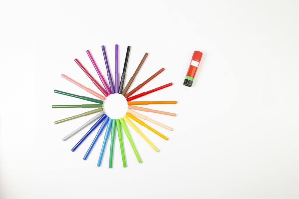
Choosing the Right Color Palette for Your Space
Chosen theme: “Choosing the Right Color Palette for Your Space.” Welcome! Today we’ll translate moods into hues, decode light, and turn swatches into stories. Expect practical tips, heartfelt anecdotes, and palette-building guidance you can actually use. Join the conversation, ask questions, and subscribe for color-smart inspiration that makes your home feel unmistakably yours.
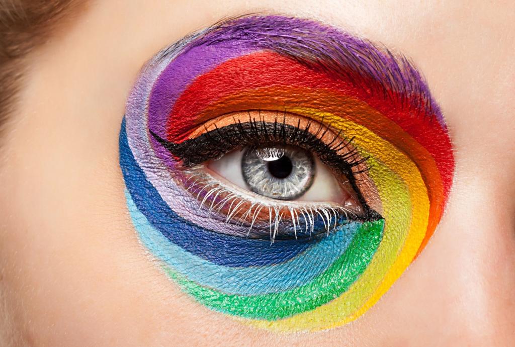
Warm vs. Cool: Setting the Emotional Temperature
Warm colors like terracotta, coral, and sunflower yellow energize gatherings and spark conversation, while cool blues, sages, and blue-greys calm the mind and slow your breathing. Consider where you rise, work, or unwind. Does that corner need a little zip, or a soothing exhale? Tell us where warmth or coolness feels right to you.
Neutrals as Anchors
Neutrals are not the absence of personality; they are the stage where your personality performs. Greige, oat, or soft clay tones stabilize a room and allow art, textiles, and plants to shine. When in doubt, anchor with a nuanced neutral and layer accents that echo your story, season after season.
Personal Associations Matter
Color memories are powerful: a grandmother’s butter-yellow kitchen, a lavender dusk from a childhood porch. One reader told us a deep teal reminded her of rainy bookstore afternoons—and suddenly her office flowed. Share a color memory in the comments; we’ll help translate it into a livable, modern palette.
Reading Your Room: Light, Architecture, and Existing Elements
Natural Light: Direction and Intensity
North-facing rooms lean cool and may soften colors into quieter versions; south-facing rooms often intensify warmth, making beiges read golden. Morning light can blush, while late afternoon can bronze. Tape samples to multiple walls and observe from breakfast to sunset. Note each shift; your final palette should succeed in all moments.
Artificial Lighting and Bulb Temperatures
The bulb you choose rewrites color. Warm 2700K lamps deepen cozy notes; 3000–3500K feels balanced for living spaces; 4000K reads crisper for task zones. Consider CRI too—higher color rendering (90+) preserves subtle undertones. If your paint feels off at night, your lighting recipe may be the real culprit.
Fixed Features You Must Honor
Floors, countertops, tiles, and large furniture have undertones—pink-beige, yellow, green, or red—that demand respect. Hold swatches next to these surfaces and squint to catch clashes. A cool grey can turn purple against a warm oak floor. Let your palette harmonize with what you cannot change and spotlight what you love.

Spotting Undertones
Compare swatches side by side against true white to reveal hidden pink, yellow, green, or violet. A grey with a purple undertone might glow beautifully in evening light but feel chilly at noon. Keep three neutrals with different undertones on hand for testing; your eye sharpens quickly when you practice comparisons.
Finish Matters: Matte to High-Gloss
Matte hides texture and feels velvety; eggshell offers soft resilience for busy rooms; satin adds a gentle sheen, great for trim or baths; semi-gloss and gloss highlight details but also imperfections. Higher sheen reflects more light, altering color perception. Choose durability and mood, not just the chip’s prettiest moment.
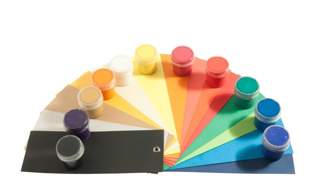
Material Palettes Beyond Paint
Color lives in wood grains, metals, fabric weaves, and stone veining. Pair bronzed hardware with earthy paints, or brushed nickel with cooler tones for a crisp feel. Bring a fabric swatch and floor sample to the paint aisle. If your materials sing together dry, they will harmonize even better at home.
Sampling Like a Pro: From Swatches to Full Walls
Skip tiny chips. Paint oversized poster boards, at least 24 by 36 inches, with two coats. Move them around the room like mobile walls. You’ll see how color wraps corners, meets trim, and interacts with floors. This one step prevents most “Why does it look different here?” surprises later.
Sampling Like a Pro: From Swatches to Full Walls
Tape samples near windows, opposite windows, and in shadowy corners. Watch them through breakfast light, workday brightness, and evening lamplight. Photograph each location to compare honestly later. Keep notes about mood and clarity. Patterns will appear, and one contender will stay beautiful when the others falter.
Sampling Like a Pro: From Swatches to Full Walls
Sit, cook, read, and rest with your samples visible. Notice whether a color soothes headaches or agitates focus. One couple told us their “perfect grey” felt stormy during late-night feedings, so they pivoted to warm cream and slept easier. Share your week-long impressions; your reflections help others choose well.

Trends vs. Timeless: Making It Yours
Forest greens, digital lavenders, and spicy reds will rotate. Sample them in pillows, lampshades, and art rather than full rooms if you hesitate. When your taste shifts, swap accents, not gallons. Tell us a trend you love but fear—let’s find a low-risk way to let it sparkle without overwhelm.
Trends vs. Timeless: Making It Yours
Collect three photos that feel like you—maybe a travel snapshot, a textile, a sunrise. Pull five colors from them and test the gentlest versions first. Translate bolder notes into accents. This storyboard becomes your compass, keeping choices aligned when options multiply. Post your trio; we’ll help name the palette.