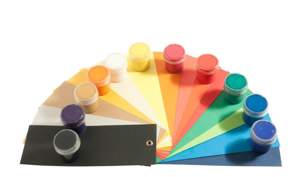
Harmonizing Colors for a Cohesive Interior Design

Today’s chosen theme: “Harmonizing Colors for a Cohesive Interior Design.” Step into a palette-first journey where hues connect rooms, soften transitions, and create an effortless home rhythm—inviting conversation, calm, and character in every glance.

Designing a Whole-Home Palette

Choose an Anchor Hue and Undertone

Select a foundational hue with a consistent undertone—warm greige, cool white, or earthy taupe. Repeat it across trim, ceilings, or large surfaces. Post your anchor hue below, and we’ll recommend complementary undertones for flooring and cabinetry.

Create Sightline Continuity

Stand at the entry and track your sightlines. Colors should graduate softly between rooms, easing the eye forward. Use stairwells and halls as transition bridges. Share a quick phone snapshot of your longest view; we’ll help map a gentle color flow.

Use the 60–30–10 Rule Thoughtfully

Let sixty percent be your base, thirty a supportive secondary, and ten the accent that sparks interest. Rotate roles room to room to keep variety. Tell us your 60–30–10 candidates, and we’ll help right-size saturation for each space.

Light, Materials, and Finish: The Hidden Color Shapers

North light cools; west light warms. Bulb temperature shifts everything. Check a paint’s Light Reflectance Value to predict brightness. Post your window orientation and bulb type, and we’ll suggest tones that stay steady from sunrise to evening.

Light, Materials, and Finish: The Hidden Color Shapers

Oak may lean yellow, walnut red-brown, marble blue-gray. Align wall colors with these undertones for harmony. Share photos of your floors or counters, and we’ll decode undertones so your palette complements rather than competes.


Sampling and Iteration: From Idea to Confident Choice

Swatch Big, Not Small

Paint oversized samples on multiple walls and observe across days. Tape movable poster boards to chase light. Comment with your top three swatches, and we’ll help identify the most stable option for your unique lighting rhythm.

Leverage Digital Tools, But Verify

Use visualizers for quick direction, then ground-truth with real paint. Calibrate your screen and compare prints. Post a screenshot of your virtual mockup, and we’ll flag potential undertone surprises before you buy gallons.

Live With It, Then Decide

Give colors a week. Eat dinner, read, and wake up with them. If morning feels harsh, consider muting saturation. Share your impressions after three days, and subscribe for follow-up guidance as your eye adjusts and confidence grows.

Stories of Harmony: Lessons from Real Rooms

We helped a tiny studio lean into layered neutrals: warm white walls, mushroom curtains, clay cushions. The space felt larger and calmer. Tell us your square footage and favorite textile, and we’ll suggest three monochrome accents to echo it.

Stories of Harmony: Lessons from Real Rooms

To unite collected furniture, we chose a soft beige with pink undertones, then added olive accents. The dining room glowed at dusk. Share your most colorful heirloom, and we’ll propose a neutral backbone that lets it truly shine.

Psychology and Culture: Color That Feels Like You

Choose restful blues for bedrooms, enlivening greens for kitchens, focused neutrals for work zones. Aim for emotional clarity. Tell us your room’s purpose and preferred vibe, and we’ll pair feelings with hues that support daily rituals.

Psychology and Culture: Color That Feels Like You

Colors carry stories—red as celebration, white as purity, green as renewal—varying by culture and context. Share a meaningful hue from your background, and we’ll weave it gently through accents, textiles, or art without overwhelming balance.

Keeping Cohesion Alive: Maintenance and Seasonal Refresh

Rotate textiles—linen in summer, wool in winter—within your palette. Swap pillow covers and throws to shift mood. Comment with your base colors, and we’ll suggest seasonal accents that maintain cohesion while feeling wonderfully new.

Keeping Cohesion Alive: Maintenance and Seasonal Refresh

Keep leftover paint labeled with date, room, and sheen for easy touch-ups. Clean gently to preserve finish. Ask us for a care checklist matched to your sheens, and follow for monthly reminders that protect your palette investment.
Sarinivalexonone
Privacy Overview

This website uses cookies so that we can provide you with the best user experience possible. Cookie information is stored in your browser and performs functions such as recognising you when you return to our website and helping our team to understand which sections of the website you find most interesting and useful.